
You’ve been asked to create a document for work. Perhaps it’s a report, a form, or even a brochure. And it doesn’t matter whether you’re using Microsoft Word, Adobe InDesign, Apple’s Pages, or even Google Docs. The best thing you can do to be nice to Future You is to take a few extra minutes to use named styles.
Future You? That’s right, imagine what’s going to happen next week, when your colleagues or your boss or your board of directors sees your document and says, “That’s great, but could you add this?” Or perhaps, “We love what you’ve written, but the text is too small—can you make it larger?” Sure, it’s no problem to make the change once, but what if there’s another change, and then another, and then another group wants something else. Before long, Future You has spent way too much time getting all that new text to fit, trying different fonts, and fussing with the document.
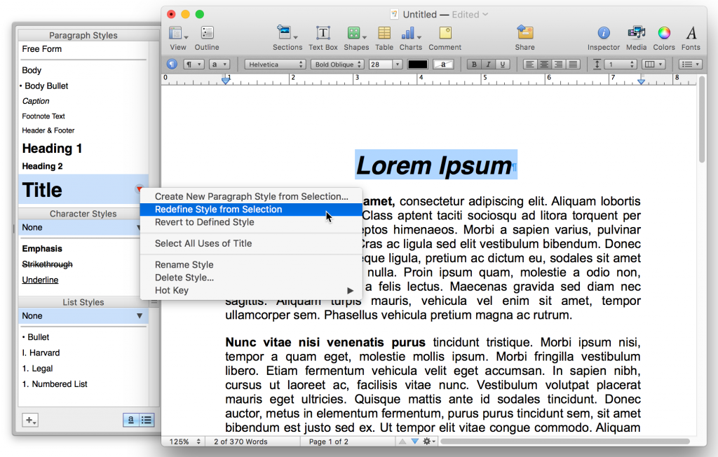
Here’s the solution: named styles. We’re not talking about simple text styles like bold and italic, but styles that define how different types of content are formatted, things like Heading, Subhead, and Body. Many apps include a full set of default named styles whose visual style you can modify, and if you want something specific, like Sidebar Caption, you can create your own named style for that.
The beauty of named styles is that once you’ve assigned the Subhead style to all the subheads in your document, for instance, you can tweak the look of all those subheads simultaneously with a change to the style. Plus, some apps like Word and Google Docs can even make an outline of your document if you use their heading styles.
Details vary by app, of course, but every notable word processor and page layout program supports named styles of various types. The most common are “paragraph styles,” which apply at the paragraph level and are good for adjusting details like the amount of white space after each paragraph. “Character styles” work down to the level of a single character, and are useful for things like warning text, so if your supervisor decides that should be not just bold but also red, you can change every instance in seconds.
Fancier programs even have “table styles” so you can format table headers and table bodies consistently throughout a long report, and layout programs may have “object styles” that let you specify that all the graphics should have a 3 point thick chartreuse line around them, and then change that to a 1 point black line after your graphic designer complains.
I'll make no bones about it—setting up styles takes a little time and thought when you’re getting started with a document, but that effort will pay off big time in the long run. Styles are your friend, and if you’re not using them now, you owe it to Future You to give them a try.

0 comments:
Post a Comment